How to design a book cover – lessons learned
 How do you know when you have got your book cover design right?
The simple answer is that you may never know – as there are so many variables that contribute to selling a book. Is the content good enough? Is there a big enough market for the genre? Is your marketing strategy working?
Taking all the other elements aside the book cover is without doubt the main hook. It is the first thing people look see they browse for a book even before they know anything about what’s inside. If it doesn’t appeal you’ve lost them.
The answer is to lower the odds stacked against you and here are some basic tips based upon my experience in designing the book cover for my own book ‘Andorra’s Box- Children’s Mystery Adventure – Six Books in One’ (co-authored under the pen name Niddy Witch).
Be unique and stand out from the crowded book shelf
How long does it take a customer to look at your book cover and decide if it’s appealing enough to pick up? Under a second? Very little time to make a first impression! ‘You can’t judge a book by it’s cover’ may be true but that is exactly what folks do – Judge!
Your book cover has to have immediate appeal whether it is in hard copy or on line and you need to capture their attention enough for them to take action – open the book, read the back cover or scroll down the web site page for more information. Text plays a major part:
- Book stores are normally laid out with the spines facing out. The font size and impact is going to be critical here
- Web based book stores use thumbnails (very small images) – so the text has to be legible as a thumbnail
 I initially used a script type foment which looked great at normal size but could not be read on Amazon as a thumbnail. I bit the bullet and opted for a much bolder block type font and although I am not entirely happy with it (artistically) it can be read easily at any size.
Take a look at 1001 free fonts.com who provide top quality fonts by some amazing designers. My advice for e books is that you have to be practical and realistic about whether the font you chose stands out (don’t let your heart rule your head!!!).
This is not so critical for book stores where the book is at full size and fonts more easily read. However with most book stores stock laid out with just the spines showing – the spine text has to be easily readable and visually eye catching.
Scaling your book title for maximum visibility
Fonts should contrast with the background. Andorra’s box has a simple white on black font for maximum contrast. I have seen books where both the background and font were multicoloured and similar in appearance – great for a book showing you how to create camouflage but useless for selling on Amazon! Another way is to use a font with an in-built shadow or create a shadow behind the text.
Try scaling down your book cover design to thumbnail size – Amazon thumbnails are approx 50 x 75 pixels. Can you still see the title clearly? If not you need to change it or it won’t work for you on Amazon or other on line book stores and review sites.
 Last but not least – does your cover text work when you convert it to grey scale. Although most new ebook viewers are displaying in color there are a lot that don’t and customers searching on a basic Kindle device may be looking at greyscale images. Would your title be seen in grayscale as a thumbnail?
If you are an author and not a designer get professional help!
 There is no logic to creating a wonderful book and then not giving it the best possible chance to sell by having an awful cover. Even Ebenezer Scrooge would have seen the logic in this. Get professional artistic help to create the best cover you possibly can. There are plenty of web sites out there which will create really good book cover designs for you.
99 designs is probably the top site for this and puts you totally in control. Submit your requirements and you will get back several designs to look at, supplied by artists from all over the world. You chose the one that you like and only pay for that. It’s a sort of artists competition and the one you use collects the fee. If you don’t like any of the designs you get your money back – win -win!
You may also know an artist who can do the job for you – just remember to give them the strict parameters you are looking for – font/size/visual impact. The bottom line is to get the best design you can afford otherwise your hard work in creating the book may be a waste of time!
 If you are a book cover designer – what information do you need from the client?
Most clients who need a cover designed have not got any specific instructions – they usually come out with some vague generic requirement. “I want an awesome book cover that will sell the book!” – GREAT! – Thanks for the information!!!
You need to sit them down and like a dental surgeon extract every last molar of information out of their head and write it down. I always send the client a copy of the discussion as a bullet point list so that there is no argument about ‘what they wanted’. Here are a few pointers when interrogating your client:
- What Genre is the book intended for – it needs to be in keeping and appropriate for that genre
- Style of image – photo/ cartoon/ logo/ in other words what style of art do they want
- Title, Sub Title and Author name plus anything else they want to include. Advise them of text size and fonts which would look great on web sites at thumbnail size.
- Colors and contrasts. Make sure they understand that some book reader displays are in black and white.
- Back cover information
- Spine text information
- Ask what they would like specifically and try to drill down so that you know and they know what they want.
- Remind them that any photo’s or other images that you are supplied with that to be included are cleared for copyright and ask them for written, signed and dated confirmation to cover yourself.
 Also ask for a synopsis of the book and a full hard copy. The book cover should reflect the contents and you may need the content to look at for inspiration. After the discussion e mail them an outline of what was discussed/agreed.
This creates four positive outcomes – A brief on the project for yourself, a brief for the client, reducing the risk of – ‘That’s not really what I wanted’. It also looks, sounds and is professional.
 Back cover design – getting the right information
The back cover is critical for conventional books as customers who are inspired by your wonderful front cover look at the back for more details. It is vital that you have the right information and may include:
- The book description
- A reason why they should buy your book
- Endorsements and sources
- Author biography (although this can be on an inside cover or page) plus optional photo
- Bar code and ISBN number where applicable.
- If you self publish you may want to add a logo
This does not apply to an e book such as Amazon Kindle which only displays a front cover. Amazon display the information associated with the conventional back cover in the book description.
The background artwork should be sympathetic to the text and not overpower it. The text should be easy to read and clear – Simple!
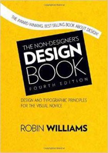
If you are not a designer but would like to learn and take full control of your book cover artwork Robin Williams – ‘The Non-Designers Design book’ is a fantastic resource with a new chapter on fonts in this fourth edition – highly recommended for both non-designers and designers alike.

